


My Process : The "Mermaid Shirt" and some other thoughts....

"That should be a shirt."
When I started drawing this up I had been painting this way for some time (i say that regarding the placing of different graphic elements in odd places. etc.). I think if you look at your mind like a library of images and compartmentalize these snap shots you take, filing them away for use in the future; when you come back to them ... If you place them in a painting, with some thought of course, it can make a painting look visually "cool"... At least to me.
A large portion of my work is gesture stuff and searching for the next way to connect these images I've painted or drawn or whatever... using colors the whole nine yards...
Color Theory, Gestalt Theory/ Principles (Balance Proximity, Similarity etc... i could bore you with these so I wont... I like this stuff so I kind of nerd out on it), looking at early 19th century work from Alphonse Mucha and Privet Livemont and early 19th century Graphic Design in general, The Bauhaus Movement just to name a few are timeless moments, pieces and ideas that define and helped pave the road for "Modern Art." If you can appreciate the work from these entities and theory based art you can start seeing it influence your own work, in turn making you better. You will understand the why behind
"hmmm...something just doesn't look right...?"
It's all visually appealing but for a reason... they might not be trying to make a social or political statement every-time (thank god)... but it's just Art for Art's sake and nonetheless has shaped the world of graphic design for many artists... and our time period.
A different talk for later would be using these for good and evil. Why some people use art and color theory to influence mood and feeling for consumer products vs. Art for Art's beautiful sake.... again a talk for another time.
Now that we talked about what I wanted to talk about...lets talk about why you clicked this blog post...
The foundation I have for the way i look at art was pretty strong and constructed well thanks to my professors (honestly never thought i'd say that about academia) However my particular Art professors were incredible..
I have an odd mind so you'll find alot of small things in my paintings. For instance this Raccoon in a larger painting....

I thought it would be rad to take a design like that and make it line work rather than paint It on.... and figure out the rest after that. A completely different approach to how i was normally producing work at the time. Originally this design was an assignment made to be an 8-Color Screen Print.

The process of screen printing in an art form is very meditative and you get a tangible piece of work to keep and individually number it as a "Limited Edition" in it's truest sense. No two prints are the same...thats whats so cool about it. It's pretty involved from designing the work and isolating the colors, to registering the marks, to burning screens and hand pulling each color.
All that considered it's alot of time and effort. I understand why printers cost so much you're paying for their work and time. Anyway.... This print was pretty cool to bring it from a drawn piece of work to a screen print to a digital t-shirt print.

The idea was pretty fried to be honest with you. I had drawn a couple tattoo style faces and just was looking at doing a series of girls faces with different nature themed headdresses. I imagined when sailors from the very early sea voyage times were seduced by a siren it was never an ugly one. If you've ever stayed up for days your mind will play tricks on you. Putting the elements together I placed a beautiful woman of the sea in the center (mysterious in ways ...like whats up with the illuminated markings on her face and eyes) , a couple reminders of home your sleep deprived mind might send you...in this case a cat, and a dangerous element that was my take on
"it could love you...or it could kill you... it depends what energy you bring... you better come correct!"
The anchor was a way I "signed" my work in college. You are not a professional yet so you dont deserve to sign your work in college apparently... whatever.... It eventually turned into the main logo element for Rigged for Sea. We can talk about that in another post it was such a cool energy exchange the way that logo was thought about, formed and why its fouled.... Another time though....but shout out to Alex "Burdman" "Burd-Daddy" Burdett @burdtattoos ( he might have been single handedly the one person who made me believe in my own work and was a heavy influence for doing art in my late teen years).... I was into how printer's made their trademarks during the renaissance times, so I gave a subtle shout out to that by making an embellished seal with my "Signature" in the center.
This was a series of 15, (3 sets of 5) all of which have homes now. So if you have one and havent bought a shirt yet well... well, its all good you have the piece.

The digital rendition came out super close to the original so I was stoked on that....
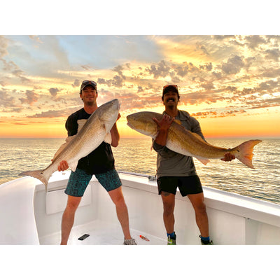
Thanks for reading about this one. I really appreciate the love and everytime somebody supports and believes in this company. My aim is to create a brand with substance that people can wear confidently and know the work came from a good place and its just cool work... again at least for me it is. Shout out to Mikey for modeling this shirt.

With much love and always so much gratitude for you all,
-J